2.23


New Features
Churn Prevention Dashboard
Churn is the top SaaS business killer among the risks threatening the life of the product. However, there are ways to minimize it and proactively reduce the probability of customer unsubscriptions. We've just introduced a new dashboard to make this easier.
The new visualization evaluates churn risk for your customers based on three factors:
- Active Users Changes over time – if there is a significant drop in active users compared to previous data, you should definitely look into the situation, contact the customer, and understand why their employees are no longer using the product actively.
- Overall Usage Changes over time – similar to user count, a drop in overall product usage within a customer's org might mean they are getting less value from the app and could consider leaving.
- Customers Affected by Errors – if unhandled exceptions have been occurring consistently for a customer in recent months, it's better to act before it’s too late ;)
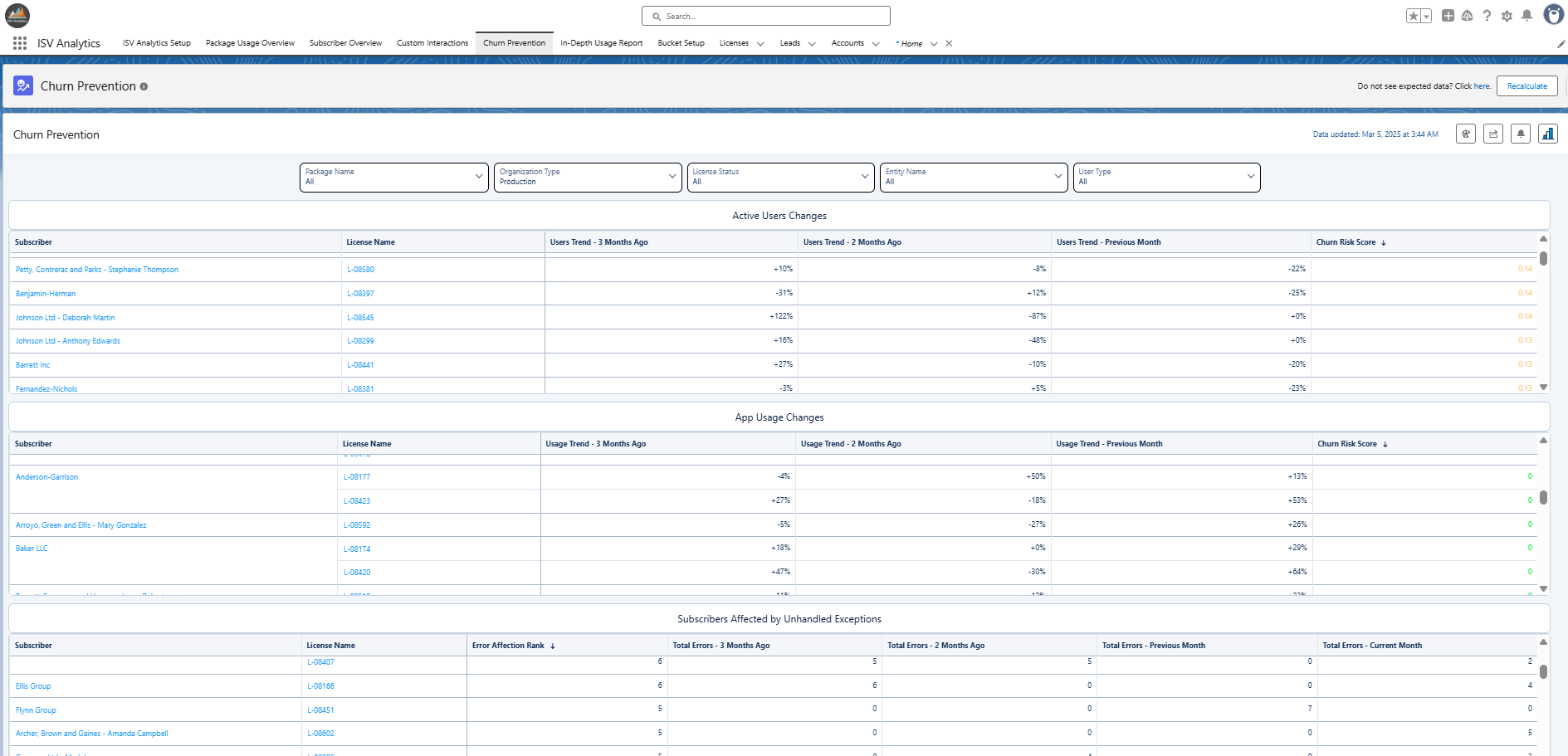
To learn more about how the risk scores are calculated and what is shown, visit the Churn Prevention dashboard guide.
Ability to Change Processing Region
For the Premium, Enterprise, and Ultimate plans, logs are downloaded by an AWS instance and pushed back to your Salesforce org. By default, the download takes place in the Central Europe (Frankfurt) instance under eu-central-1. However, you can now change this to one of the following regions:
- N. Virginia
- N. California
- Mumbai
- Sydney
- Tokyo
- Frankfurt (default)
- Sao Paulo
For more information on how to change the log processing location, refer to this guide.
Note: We NEVER store your analytics data outside of your Salesforce org. We only use the AWS service to download it and push it back to your Salesforce org (to overcome heap size limitations). To learn more how your data is processed, see this article.
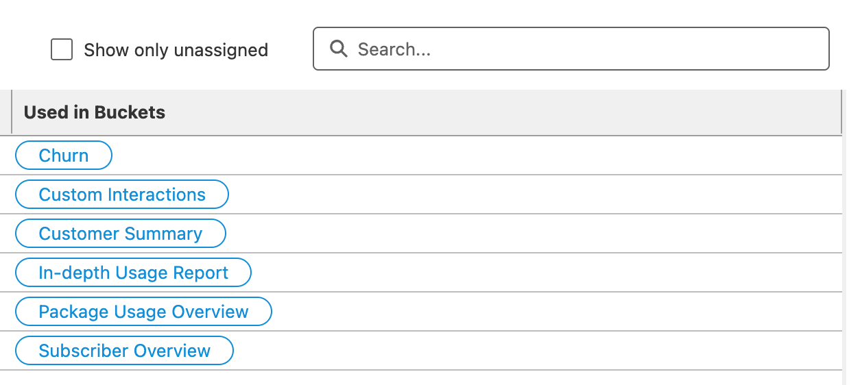
Bucket Setup – Show Only Unassigned
Now, when creating feature buckets, you can opt to display only components that haven't been assigned to any bucket.
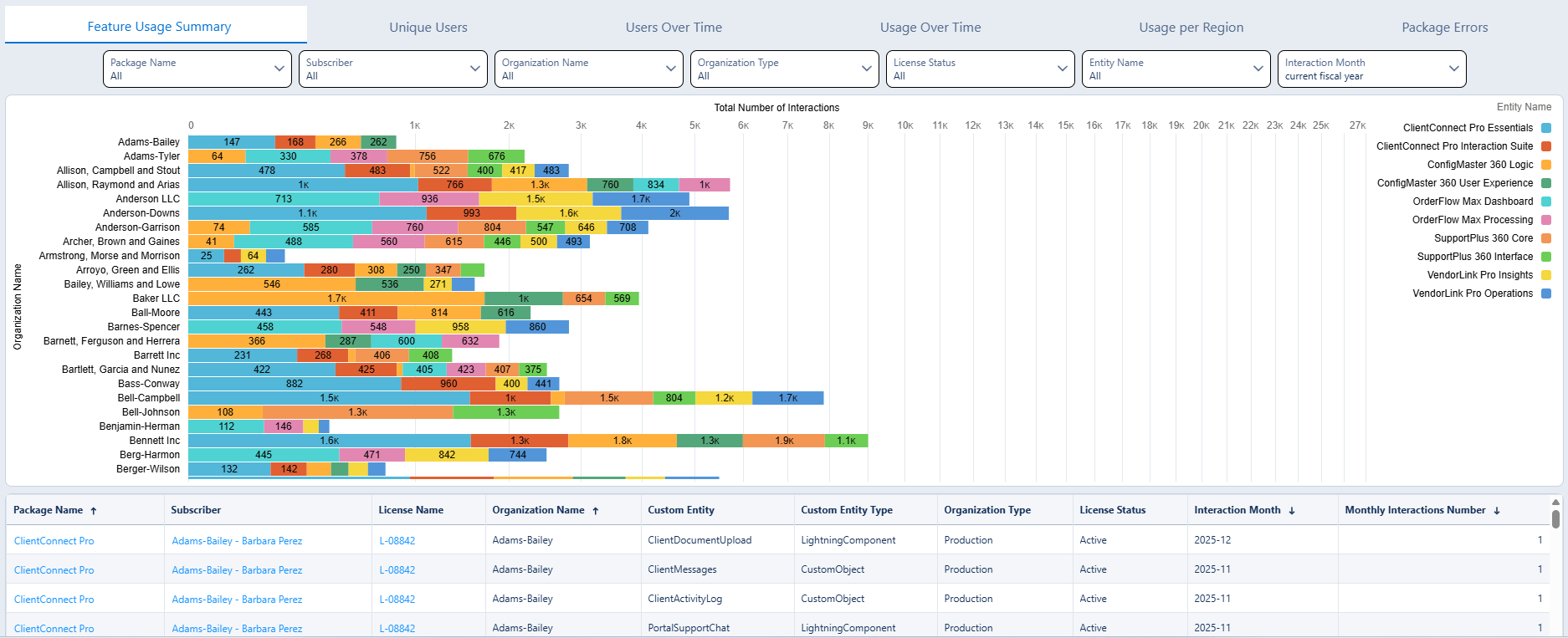
Logarithmic Scale for Usage and Custom Interactions
When you have customers of different sizes, some might generate large amounts of interactions with your app, while others interact with it at significantly lower levels. To support this kind of disparity and still clearly visualize interactions on the dashboards, we changed the X-axis scale to logarithmic for the Feature Usage Summary and Custom Interactions dashboards.
Improved Aggregation Column Names for All Dashboards
We renamed some of the aggregation columns you can use to create notifications. Thanks to that, you will now see meaningful names in your email alerts.
Bug Fixes
- Days to Expire number showing incorrect values for licenses that expired in the past.
- Already expired trial licenses shown as Trial instead of Expired on the Subscriber Overview dashboard.